by Michele Collins
When Outlook 2013 opens into the Mail view, the navigation panel is now collapsed by default. Previously in the 2010 version, this panel took up approximately one third of the entire viewing screen. This particular enhancement reduces the visual clutter. Now when the Mail view opens, all that shows is the mailbox and the reader pane which share the screen fifty-fifty.
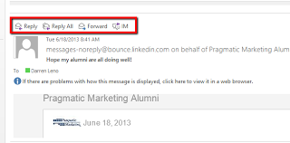
The reader pane itself is privy to some convenient new updates also. Before in Outlook 2010, after clicking the Reply, Reply to all or Forward features across the top of the ribbon, a new window would pop open in which to compose an email. Now in 2013, these same options to compose emails appear right across the top of the reader pane. When clicked, the email can be composed right inside the reader pane. This cuts down on the clutter of open screens.
The Mail view provides some other improvements as well. Instead of just showing the amount of unread emails at the top of the inbox, there is now a way to sort the emails by using the All and Unread buttons that are provided there. No more digging through your inbox to see which email was missed. Now in 2013 version, just click Unread and immediately see all of those skipped emails.
Another handy feature in 2013 is that there is an X inside the email item boxes themselves to be used for immediate deletion. In the former 2010 version you would have to redirect your mouse up to the top of the panel for that X to delete. Also, now it’s possible to view the inbox items with a few lines of email text showing so emails can be easily sorted through without actually viewing their full contents. The 2010 version only offers sight of the sender and subject line. In addition there is a completely new zoom feature which will increase the size the viewed email font.
 |
| Deleting email from Outlook 2013 mail view |
The Sneak Peak feature is another brand new feature introduced in Outlook 2013. In the bottom half of the collapsed navigation panel are icons representing the familiar Mail, Calendar, Contacts (now called People in the 2013 version) and Tasks. Info from these sections can be obtained without actually having to click into the icons. For example, if you hover your mouse over the Calendar icon, you can see the current month’s calendar appear and if you click on any certain day, you can sneak a peek at anything scheduled for that day.
 |
| Sneak peek in Outlook 2013 |
These are only some of the changes and improvements that have happened from the Outlook 2010 version to the current 2013 version. The basic functionality of
the program remains the same. However, these newest improvements do provide further convenience and streamlined functionality when using the inbox view.
the program remains the same. However, these newest improvements do provide further convenience and streamlined functionality when using the inbox view.

